One challenge in designing modern logos is scale: It should appear properly online and offline across a wide range of screen sizes

As humans we can have emotions triggered by the simplest of things, but did you know that logos have the power to connect consumers on a deep and powerful level?
We attach ourselves to the brands we love and identify with the visual representation they project. Today, we are bombarded with branding opportunities wherever we go, but disregard the ones we don’t connect with and emotionally internalise the ones we do.
Successful logo design is all part of a company’s branding strategy, and is used to guide their chosen audience to a desired action. But it’s not often we stop to think about the humble beginnings of things we interact with every day, such as logo design. So, where did it all begin?
In the beginning
Since humans walked the Earth we have been communicating through art. All we have to do is look at cave paintings from 40,000 years ago to see complex messages of hunter-gatherer life made understandable through art.
Fast forward to Ancient Greece, and we can begin to see the origins of logo design as we know it. Coins were monogrammed by rulers as a way of understanding social rank, much like the way a designer handbag is emblazoned with a logo and flaunted on the high street today. Ancient Egypt also sees this type of cultural classification through the use of symbols.
The dawn of the 13th century leads us to the Renaissance, wherein craftsmen such as potters and goldsmiths would use rudimentary machines to claim authorship of their work. This was done by chiselling and pressing logos into their designs.
With time, comes technology, and by the 19th century industries were using printing plates to create art. However, original artists were often not credited for their work at this time, thanks to the printing companies taking credit for the creations.
As the Victorian era became established, there was a cultural shift and not only was printing now cheaper, but consumers were more interested in style and flair than ever before. This lead to a huge influx in typography and unique fonts used to characterise brands.
The first logo
After the days of craftsmen not gaining the correct exposure for their work, suddenly there was a surge in ownership thanks to the ability to produce products en masse. This is what lead to companies creating exclusive logos as a mark of their work.
The first logo ever trademarked was in 1876 for Bass Brewery. It was a red triangle with the “Bass” text beneath, also in red. The font was a sweeping cursive text echoes that of the infamous Coca-Cola logo of today. Though just a coincidence, it seems strange that the first ever logo is akin to one of today’s most successful brands.
The first thoughts on colour psychology emerged at the same time as logos launched and red was described by the author of Theory of Colours Johann Wolfgang von Goethe as this:
“It conveys an impression of gravity and dignity and at the same time of grace and attractiveness.”
Latest logo design trends
Today we are more emotionally invested in logos than before, as we internalise brand messages and interact with brands more than in the past. The competition is fierce, and designers must create logos carefully and strategically in order to best put forth their image and attract the intended audience.
With the rise of digital technology comes the need to rethink branding and logos once again. A one-size-fits-all monogrammed coin is simply not an option for millennial life. Today, it’s more important for logos to be scalable, thanks to the plethora of screens we engage with on a day to day basis. This includes smart phones, smart watches and smart TVs. Today, brands are expected to market their brand and communicate with customers via print, social media, websites and apps. Logo Design brand Repeat Logo believes that:
“When thinking about a brand we will often visualise their business logo and a recognisable image is what us as customers will begin to remember. Humans, especially creatives are visual by nature, therefore logo design should target instinct to increase brand visibility.”
Many companies are choosing to re-design their logos to be more in line with the modern world that has encompassed us so quickly. This isa dangerous task, however, as brands risk consumers feeling alienated by their new, but necessary, designs.
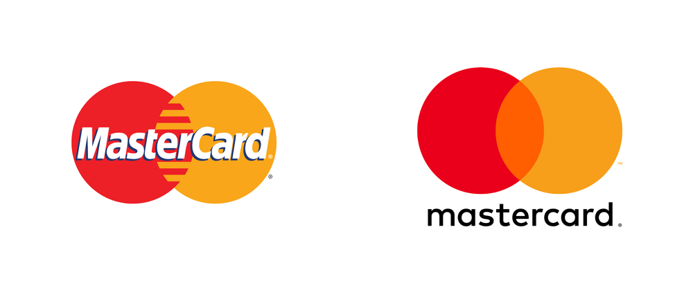
Case in point: How did MasterCard change its logo for the digital age?
One brand that has successfully rebranded is MasterCard. The 50-year-old financial giant has managed to align itself with the digital age and still maintain its loyal customers’ faith that the company is not changing its fundamentals.

- The cluttered ‘teeth’ were removed in place of overlapping circles, which can be scaled without looking distorted on smaller mobile banking applications.
- The orange central colour is to connote the transparency of the brand and their modern banking solutions.
- The ‘flat’ design provides great user experience for digital customers.
Logos in marketing
A brand logo can be one of the most powerful tools that a business has. It acts as the recognisable face of the brand and communicates the company’s values without the need to use words. Just like in the days of cave painting, we can understand masses of information just by decoding a visual representation. Today, the market is flooded with strategic logo design so companies must work harder than ever to differentiate themselves from the crowd.
—-
The views expressed here are of the author’s, and e27 may not necessarily subscribe to them. e27 invites members from Asia’s tech industry and startup community to share their honest opinions and expert knowledge with our readers. If you are interested in sharing your point of view, submit your post here.
Featured Image Copyright: radub85 / 123RF Stock Photo
The post Branding advice: Logo design tips for startups appeared first on e27.