Your defining features could be the problem

Two years ago, we took a long hard look at our business.
We had recently made substantial changes to our business model but weren’t getting the results we wanted.
After spending some time with a whiteboard and a few smart people, we could see clearly where we needed to focus our efforts — we had a lousy conversion rate.
There were two possible solutions:
- We could get more eyeballs — drive more traffic to the website.
- We could figure out why our product wasn’t converting.
Let me state the obvious — dramatically increasing the traffic at your site is not easy. We were already doing everything we could on this front.
Besides, with bad conversion, we were throwing a huge amount of users away. It made a lot more sense to focus on option 2.
Still, option 2 was no easy road. Determining what is preventing users from converting is difficult.
For example, we use Aha! to collate user feedback — and listening to users, you would believe we just needed to add more features.
But features are rarely the reason software adoption efforts fail, plus our product already had a shit ton of features.
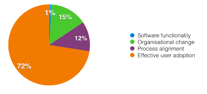
According to research from the University of Washington, here’s what is important for software adoption:

Most important factors for realising the value of software (I got this from HBR/University of Washington. But sadly can’t find the original link)
As you can see, functionality is rarely the problem. We also looked at our usage metrics to see if any particular feature was standing out.
After some research, it turned out several features had a high correlation with conversion.
Unsurprisingly, they were the features that made Hiri different from other email clients.
Great! Surely all we needed to do was inform and educate. Tell users about these fantastic features so they would use them and convert.
Time for a new onboarding mechanism
At Hiri, we’re big fans of Samuel Hulick’s UserOnboard.
By tearing down some well-known applications, Samuel does an excellent job of teaching people how to think about onboarding. It’s fantastic.
We created an onboarding process that followed Samuel’s rules. We refined the login process, carefully highlighted our key features. We took the time to craft the copy, adding some much-needed personality. The results made us pretty happy.
But, when we pushed it, it didn’t have the impact we were hoping for (not blaming Samuel here!).
We iterated and measured, redesigned and tweaked. But nothing seemed to work.
The reality was that most users paid little attention to our onboarding.
They weren’t reading our precious copy. They simply blazed their way through it as quickly as possible — dismissing pop-ups and walkthroughs just as fast as they could click.
I mean, who doesn’t know how to use an email app?
A different lens to look through
I’ve been handling “User Experience” (UX) since before it was called UX.
By training, I’m an Industrial Designer. A lot of UX concepts have been taken from Industrial Design, but I think one is particularly relevant when it comes to onboarding:
Mental models.
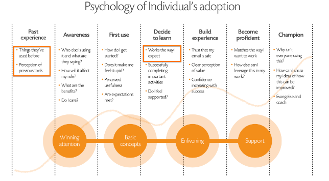
A mental model is an important part of the product adoption process, which looks something like this:

The line in the background depicts how a user is feeling at a particular gate. Might cover this in a future post.
I’ve highlighted the attributes relevant to mental models. The two key points here are:
- Your product should work the way I expect it to.
- How I expect your product to work is largely based on my experience using other products.
I’ve known this stuff for a long time but always looked at it as a usability principle rather than a conversion principle.
Also Read: These are the five startups joining Phandeeyar Accelerator third batch
We use elements of this stuff throughout Hiri.
For example, we use conventions that people are familiar with; dropdowns, toolbars, autocomplete, yada yada.
But it occurred to me that we might be able to leverage this principle to help with conversion.
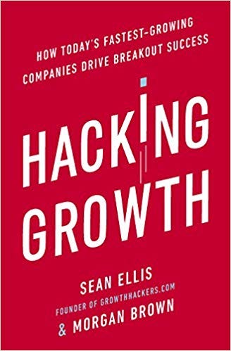
The other important onboarding concept came to light when my co-founder, Kevin, finished the book Hacking Growth, by Sean Ellis.

In his book, Sean talks about finding your Aha moment:
“The Aha! moment is the point in the user experience where your product’s value becomes clear to your users. You judge whether and how this happens on a product-by-product basis, but the end result you’re looking for is usually conversion or long-term retention.”
The basic premise is simple.
When marketing to your user base, you make a promise. This promise should be the compelling value you offer to your user. And, it should match your Aha moment — the moment when you fulfil this promise.
The sooner you can get your users from promise to Aha, the more likely they are to convert.
A sudden realisation
We were pretty sure we knew what our Aha moments were.
Hiri is an email client. We have some unique features. We knew that when users understand and use our unique features, they converted.
But we hadn’t considered this as a function of time.
When we investigated how long it took a user to get to our Aha moment, we realised it took about a week.
A week! That’s way too long. Most people don’t have that kind of patience.
This is where it gets really interesting.
Also Read: This startup uses AI to convert complex data into memorable visual stories
Remember what I said about mental models? Well here’s the thing.
Our Aha moments, the features that made us different, were also the reason people weren’t sticking around.
People expect an email client to work a certain way. Our unique features made us too different.
They made the interface unfamiliar — if you didn’t engage with our onboarding, chances are, you were lost.
So what do you do when your Aha moment is also the thing that’s killing conversion?
We took all of these features out. Every single one of them.
And by doing so, we created a bog standard email client. It did everything a regular email client did, and nothing else. It worked exactly as users expected it to — so we didn’t need our complicated on-boarding anymore.
But that’s not exactly a compelling proposition.
When I say we took them out, I’m only telling half the story.
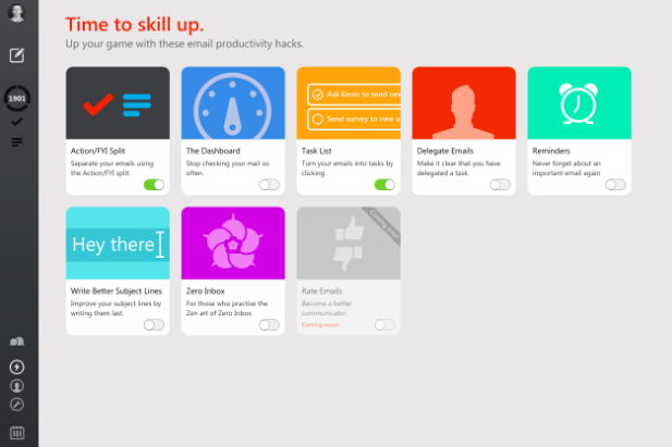
We took them out of the User Interface (UI), but we put them somewhere else. We created a ‘Skills Center’. You accessed it via a button that we highlight early in the user journey. It looks like this:
It is the only thing that stands out from an otherwise familiar UI.
Now, when a user played with Hiri for two minutes and realised that there’s nothing new or different, inevitably they clicked on the one thing that was. And when they do — we have them.
In the Skills Center, you can add the features that make Hiri unique. In your own time, you can explore these features and turn them on.

This is a much more natural way to discover features.
It puts the user in control — no more force feeding them information through a complicated educational onboarding process (which people ignore anyway).
More importantly, it reduced our time-to-Aha moment from one week to one hour.
Our conversion rate shot up from 1 in 50 to 1 in 10. A huge difference.
Conclusion
This approach isn’t going to work for everyone. But I think everyone can take something from it.
Here are the key takeaways:
- Know what your Aha moment is.
- Know how long it takes to get there. Try to reduce this time.
- Be aware that what makes your product unique could also cause confusion.
- Try to meet user’s expectations — before they use your product, how do they think it should function?
- Find ways for users to take control and discover your USP/Aha moment naturally.
I hope you’ve found this article useful. Questions, comments? Leave them below and I promise that I will try to answer them. If you liked this article, please share!
—
David Power is Founder & COO of Hiri, an ingenious email app.
Photo by John Schnobrich on Unsplash
e27 publishes relevant guest contributions from the community. Share your honest opinions and expert knowledge by submitting your content here.
The post A novel approach to onboarding appeared first on e27.