Because first impressions last

When you’re first starting out in business, it seems like there are a million and one things you need to do to get your business off the ground. You need to get a website, register your business name, do market research, product development, advertising… the list goes on.
And another area that needs your attention? Design.
Solid design is a hugely important element in any successful business. We humans are visual creatures, and we tend to judge people, places and things based on looks. So if your brand is sloppily designed, we’re going to assume that you run a sloppy business, as well. That’s why it’s SO important to focus on great design from day one.
But design can be overwhelming, especially when you’re in launch mode and dealing with the other million things on your to-do list. So when you’re first starting out, you’re going to want to begin with focusing on the must-haves of business design.
Here are 3 design essentials you need to kick off your business:
#1: A brand color palette
So the first thing you need to do before falling into the rabbit hole of corporate design is choose a brand colour palette. The colours that you choose — which will be incorporated into all of your branding and design from here in the end of time — can either work for you or against you, and you want to make sure that you choose a colour palette that’s going to connect with your ideal audience and inspire the kind of response you’re looking for.

Source: Sport at the Service of Humanity 2016 | Branding
While choosing a colour palette seems like it would be a simple process (I like blue, green and black. GO!), there are actually quite a few factors to consider.
Choose colours that work together
A brand colour palette that clashes is just going to be an eyesore. Choosing red and green to be your lead colours? Not going to work unless you’re a Christmas brand. Yellow and purple? Not unless you want your audience to think of Barney the Dinosaur when they think of your brand.
Choose colours that complement each other and create a cohesive colour experience.
Choose the right number of c0lours in your palette
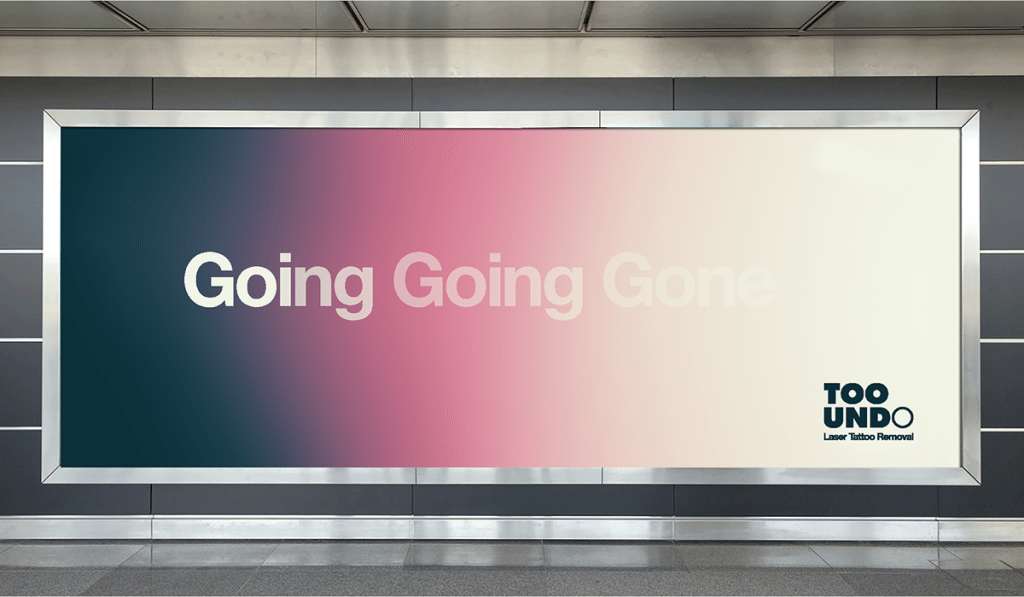
Source: Too Undo Identity by Gary Corr
Your brand colour palette shouldn’t resemble an artist’s palette, complete with 27 different colours. Ideally, chose one to two primary colours (which will be used for the majority of your design) and another one or two accent colours (which will be used more sparingly). Once you pass three to four colours in your brand colour palette, you’re veering into the ‘this hurts my eyes’ category.
Also Read: Branding basics: 6 steps to an effective e-commerce branding strategy
Leverage colour psychology
There’s so much more to colour than meets the eye. While you obviously want to choose colours that you like and feel are a representation of your brand, you also want to leverage colour psychology.
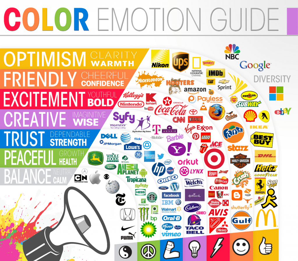
Credits to: The Logo Company
If you’re not hip to the term, you might be wondering “Uhm …What is colour psychology?” Well, according to Wikipedia, colour psychology is the “study of hues as a determinant of human behaviour.” Or, from a marketing and branding perspective, using colour to inspire a certain set of feelings and actions within your audience.
Now, just like actual psychology, colour psychology isn’t a foolproof science. Every person is different and is going to bring their own unique set of ideas and experiences to the table, which can have an impact on the way colour affects them. But there are some general rules of thumb when it comes to using colour that you can use to your advantage.
Want your brand to be viewed as daring and edgy? Try incorporating red. Looking for more of a serene vibe? You’ll have better luck with blue. Have a mostly female audience? Try softer colours — women prefer softer colour palettes while men prefer bolder colour choices.
While there’s no one-size-fits-all answer to how your audience will respond to your colours, using colour psychology can help you get both the brand perception and results you’re looking for.
#2: A memorable logo
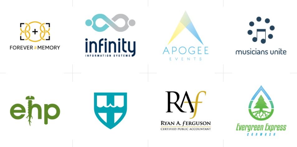
Logofolio by http://designphilled.com/
Once you’ve got your colours locked in, the first thing you’re going to want to design (or have a designer create for you) is your logo. Think of your logo as the face of your business: It’s the first thing that most of your audience is going to see, and it’s going to be the first thing they remember when they think of you.
Your logo is going to be closely tied with your brand identity and how you’re viewed in the market, so this is NOT an area that you want to where you want to cut corners or slap something together and call it a day. Your logo design requires some serious thought, consideration, and effort.
Also Read: Branding basics: 6 ways your business can benefit from multiple domain names
So, how exactly do you go about creating a logo that’s memorable, is true to who you are as a brand and makes people think “Yep… that company knows what they’re doing when it comes to design”?
Keep it simple
One of the biggest mistakes that you can make when designing your logo is trying to make it too, well, big. Trying to fit five graphics and six different fonts and a rainbow of colours into one logo is going to (a) look terrible, and (b) overwhelm your audience — possibly to the point where they feel the need to cover their eyes.
Great logos focus on one or two design elements and do them exceptionally well. Keep your logo simple and streamlined, and you’ll make more of an impact.
Keep it versatile
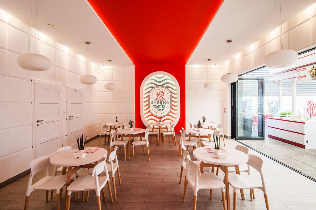
Source: SYRENA Ice Cream | Branding
Your logo is going to go on literally EVERYTHING you create: your website, your stationery, your business cards, pens, the t-shirts you print for your annual blogging conference. It’s going to go on a wide variety of items, so you need to make sure that it’s versatile enough to work in multiple places. If you have a logo that looks great on a backpack but terrible on a corporate letterhead, it doesn’t have the kind of versatility you need to be the face of your business.
When you design your logo, ask yourself: Will this work just as well on the web as it will in print? Will it pop and make an impact on marketing materials as well as it will on your assorted company swag? If the answer is no, you’ve still got some work to do.
Keep it modern AND classic
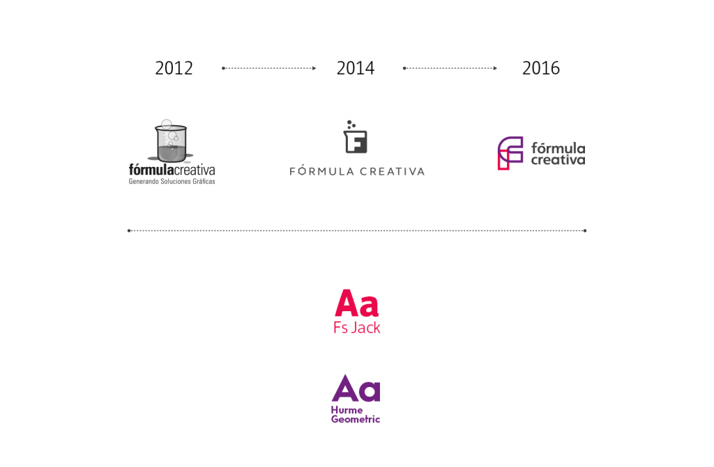
Source: Branding Studio – Identity
The best logos find a balance between being timely and being timeless. You don’t want your logo to feel dated, but you also don’t want to create a logo that’s ‘on trend’, only to have those trends go out the window next year, taking your logo’s relevance with it. So putting a #hashtag in your logo? Probably not the best idea.
When designing your logo, you want to create something that feels timeless. Incorporate modern design elements, like timely font or style choices, but also make sure that your end design is something you feel will be relevant and usable five or 10 years down the line.
#3: Social media images
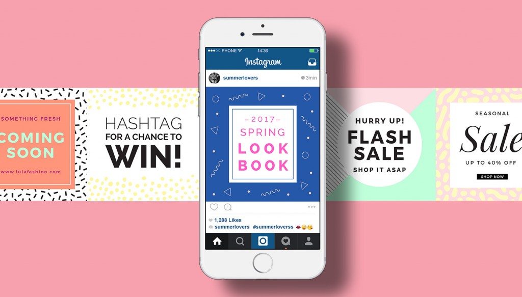
Source: Modern Pattern Social Media Banners by Zeus Z
Whether you’re a solopreneur, a small team or a huge corporation, a huge part of your business is going to take place on social media.
The best place to capture your audience is where they already are. And in 2017, millennials to baby boomers (and literally everyone in between) are on social media. Having a strong presence on the major social media sites — and a solid strategy to help you meet your business goals — is a must. And an essential part of that strategy needs to be well-designed social media images.
Whether you create a meme to inspire a LOL from your audience or an Instagram post to advertise your upcoming webinar, you need to have well designed images to support your social media objectives.
Also Read: Branding basics: Logo design tips for startups
Now, if you’re thinking “that sounds great, but I have zero idea how to create social media images,” no worries! While it used to be that you had to be a design expert with working knowledge of high level design software to create compelling social media images – or spend an arm and a leg hiring a professional designer to create them for you – that’s just no longer the case. Design platforms like DesignBold make it quick, easy and pain-free for even the most design-challenged professionals to create beautiful, pro-level images — no experience required.
We know that launching a business is overwhelming. But even if you’re swimming in ‘to-do’s’ to get your business off the ground, spend the time and energy to get these 3 business design essentials done (and done well). They’ll make a huge impact on how your business is received and can have a direct impact on the success of your launch.
The takeaway
Once you have these three design essentials locked and loaded, you can build the rest of your design assets as you go along. But a brand colour palette, a logo and creative and compelling social media images are an absolute must before you reveal your brand to the masses. So get out there and get designing!
—-
The views expressed here are of the author’s, and e27 may not necessarily subscribe to them. e27 invites members from Asia’s tech industry and startup community to share their honest opinions and expert knowledge with our readers. If you are interested in sharing your point of view, submit your post here.
Featured Image Copyright: pressmaster / 123RF Stock Photo
The post Branding basics: 3 design essentials to help kick off your business appeared first on e27.