How to make use of CTA’ s for growing your business online

You’re really confident with your website: Everything is under control. The process is smooth and secured, the products are carefully prepared. However, your sales are a standstill, when others start to gain profit.
What makes the difference between you and them?
The answer is Call-to-Action or CTA.
Although eCommerce is an ideal way to shop right now, the average conversion rate of webshops is just 2.86 per cent in 2018, globally. Optimizing CTAs is definitely the game-changer in the competition.
What are CTAs?
Now you start to wonder, what are CTAs? Yes, it does sound like the name of a popular video game.
A Call-to-Action or CTA is “a piece of content intended to induce a viewer, reader, or listener to perform a specific act, typically taking the form of an instruction or directive.”
Simply put, CTA is an image or line of text to prompt your potential leads to take particular actions, such as “Buy Now” or “Sign Up Here.” Within the scope of a website, CTAs can be banners, popup ads or buttons that make visitors click on a link or scan a QR code.
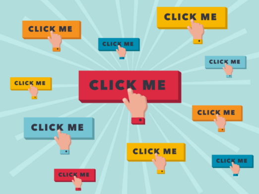
How CTAs help you grow your store?
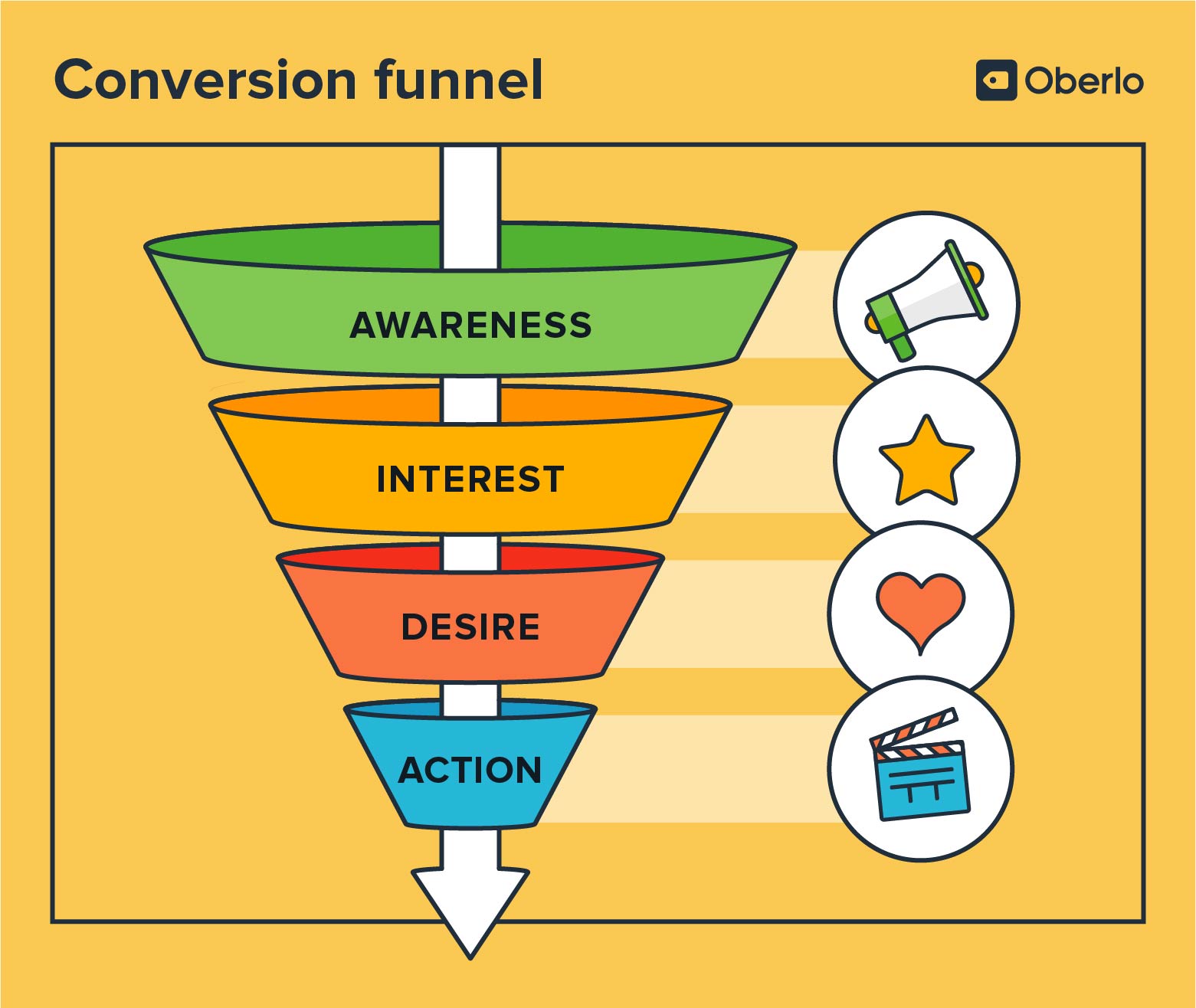
CTAs play an important role in the eCommerce conversion funnel.
This is the start of customers journeys when you capture their attention and create awareness about your products or services. CTAs are the key to serve the purpose your stores: Selling products and converting visitors into loyal customers.
A simple and crystal clear direction saves up users’ precious time, which creates a satisfying buying session. CTAs eliminate customers’ confusion since they tell them what to do next, or which is important and popular deals right now.
CTAs also lead customers to where YOU want. They give users a deeper insight into your product through eye-catching and crucial content.
They don’t show the whole picture for your potential leads, however, it piques their curiosity about what’s behind the ads. Humans are drawn to exciting exploration and with the help of CTAs, visitors will be at the right place you want them to be.
With all the amazing benefits of CTAs, more and more stores are taking the advantages of these tools to maximize their profits and create effective engagements with their customers.
What makes an attractive CTA?
We believe you have understood the reasons why your store needs to utilize CTAs. But the big question is:
Among hundreds of CTAs online, how to keep the visitor interacted with your information rather than ignore it? Let us show you how to make an irresistible CTA.
No doubt that your content should be spotted on.
As its name, CTAs literally call out the customers to take the desired action. So how can they do that if the content is tedious?
The tricky things here is creating content that makes the customers want more. They can’t wait to know more about the products, promotions or subscriptions.
Your content should be short in length and have a sense of urgency. No one wants to read a wall of text right at the first time they encounter a product. What they want is the key reason why they should continue this road.
Besides, time constraints are a great ally of yours. The risk of losing a good opportunity can make customers take action as soon as possible.
CTA messages should be related to your site. Relevant and useful content is a smart choice comparing with out-of-nowhere information. The content should support the main purpose behind the CTAs, rather than overshadow it. Thinking of CTAs as icing on a cake, delicious with the right amount.

However, like a dish, even if the taste is out of this world but the presentation is unappetizing, your food still doesn’t meet the perfect standards. This is also the case of CTAs when you come up with a flawless content however the design cannot convey your message, so you fail the task of keeping customers’ interest.
So, the design is extremely important in CTAs. There’re some factors you must consider when it comes to planning an attractive CTA.
Placement
CTAs should be arranged based on the needs of the website. Don’t focus only on the first or check-out page, you should place them evenly among pages. It’s a bad strategy to stick to one type of CTA, so be creative in using diversified CTA type.
Besides, you should not make visitors scroll below the fold. Fundamental and appealing information or campaign should be in the same place. Most people do not go further on a page when they finish their purpose. So remember to place CTAs and product’s information smartly.
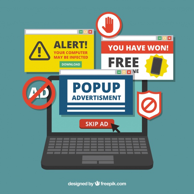
Don’t cross the line in the quantity of CTAs. It’s essential to have enough CTA to keep visitors’ interest, but cover the page with CTAs will counter attack your strategy.
Size and Shape
Appearance matters. You cannot show your visitors an ad that is too long or too small. Don’t let them down right after they enter your site.
Also Read: Honest e-commerce mistakes that piss customers off
CTAs act just like a “Hello” and if you make a bad impression, your relationship with future customers becomes more difficult than it should be. With enough wow-factors and a suitable format, you will win your customers’ heart easily.
Colour
The quest to find the right colour for your website is much more difficult than what people think. It needs to fit with other visual elements of the page, and at the same time create a hook for users to interact.
This is when the A/B test shines. Careful testing results in choosing the perfect colour to increase conversion rate and reduce abandoned cart.
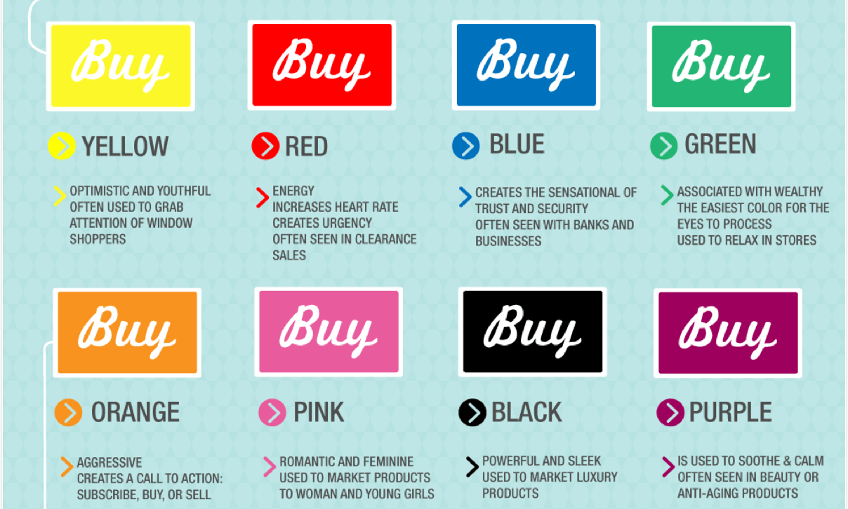
The visibility of CTAs also enhances the appearance of your site. But be cautious, overusing colours or blending the CTAs in the wallpaper will not help your marketing plan.
Mobile-friendly
Cross-channel experience is not a strange phenomenon in the world right now. So when building CTAs, developers should take a mobile phone’s interface into consideration. Customer’s journey should be seamless whether by computer or other devices.
Type of CTAs
In order to not get customers bored and pay no attention to your products, various types of CTAs should be applied. Below are some common usages of CTAs that we see every day.
Buttons
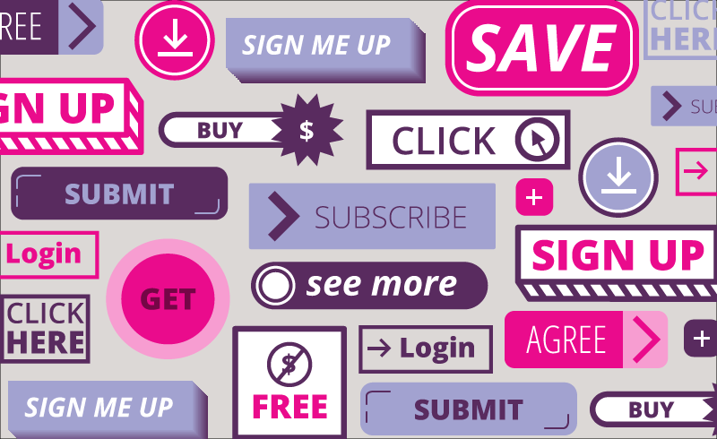
Buttons are the most popular form of CTAs. We always see a button that says “Shop Now”, “Register Here” or “Read More”. These buttons though small and simple but it captures the attention and creates immediate feelings to get more information or finish the purchase right away.
Popups
Another type favoured by store-owners is Popup. The surprise factor and flexible design make Popups become the new leader in CTAs field.
At Magenest, we provide our customers with Magento 2 Popup extension that let them create various attractive
Popup ads easily and quickly. Our extension supports other types of CTAs such as Yes/No verification, contact form, social sharing or subscription form.
Magento 2 Popup gives you multiple templates and trigger rules to make your popups appear at the right time and right place.
And with Magenest, you can have this amazing extension for free. So don’t hesitate to download our product to upgrade your website’s interface.
Banners
Whether it’s online or offline, banners can catch your eyes immediately.
Also Read: 10 ideas on how to increase interactivity in e-commerce stores
The frequency of banners appearing on your site can inform visitors what to buy, which step they should do, or when the deal closes. Different from popups, banners don’t have the surprise element, however, they stay on the place all the time.
Social sharing
Social networks can expand the scope of your audience as they connect people who share the same interest.
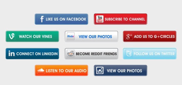
Making your brand visible on platforms like Facebook or Instagram is on top of the list for modern businesses.
So CTAs linked with social networks have become common, which is a great way to collect customers’ opinions about your products/ services.
Review
Feedback about your store’s performance can improve the status of your business as well as fix disturbing errors.
Customers usually forget to write reviews for products because this section is usually at the end of the page, and when they finish shopping, merely no one come back to write a comment.
That’s why the review CTAs are necessary, for the benefit of both the customers and your stores.
Subscription forms
Converting visitors to loyal customers is the ultimate step in the conversion funnel. You want users to come back and continue purchasing at your store when they satisfied with the service. You want them to acknowledge all the sales and promotions.
So making them a part of your system is the right choice, and CTAs are here to help you bring your store closer to the customers.
Promotion codes
Admittedly, people love a discount. CTAs with a promotion code can grab the attention of customers right at first glance. This is one of the best ways to boost your sales and promote awareness about your brand.
Make use of CTAs now!
After our thorough analysis of CTAs, we hope to successfully persuade you on optimizing the advantages of Call-to-Action tools.
CTAs guaranteed to increase your sales, grow your audience and give you new methods to promote your brand.
So don’t leave your store behind in the intense competition, let CTAs help you boost up the development of your business, starting today.
Also Read: 10 mistakes that can kill your e-commerce business
–
Editor’s note: e27 publishes relevant guest contributions from the community. Share your honest opinions and expert knowledge by submitting your content here.
Join our e27 Telegram group here, or our e27 contributor Facebook page here.
Image Credit: Cleo Vermij
The post Calls-to-Action (CTAs) in e-commerce: A simple way to maximise your conversion appeared first on e27.