We all buy into the power of data, but how do we use it to drive action? How do we realise its full potential?
We all buy into the power of data, but how do we use it to drive action? How do we realise its full potential? The secret lies in the sweet spot where creativity and data collide.
For our latest event, Nugit partnered with some of the world’s top data storytellers — people literally changing the world through data.
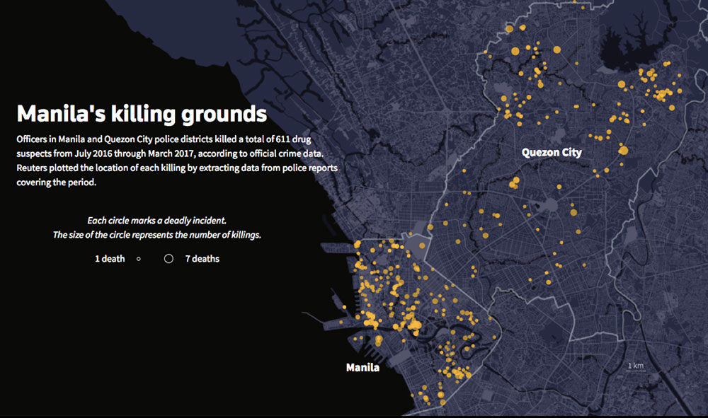
Simon Scarr’s award-winning data visualisations for Reuters have drawn international attention to flood risks, brought to life hard-hitting stories of police corruption and given people insight into life in ‘invisible’ refugee camps.
As a TEDx speaker, Harvard Graduate and Data Artist, Carrie Roy has spent her career wrestling between Art and Science, creating beautiful stories that have inspired thousands.
From the world of Data Analytics Jyoti Jain (Johnson & Johnson) and Mukkul Dasgupta (LinkedIn) shared their business perspectives on pioneering the shift from data to storytelling. Jyoti and her team have proved that the storytelling movement can make a huge impact on how to better run businesses.
Here are our top 10 takeaways.
1. Let the data lead the story
Don’t force data into a predetermined outcomes but rather look at what it’s actually trying to tell you. It might be tempting to hone in on the figures that reinforce an existing point of view but by doing this you could be overlooking a much more interesting insight.

As Deputy Head of Graphics for highly respected international news agency Reuters, Simon Scarr and his team are often faced with huge amounts of data on a subject and need to distill it into an impactful story.
Simon shared a gripping account of an instance where his team uncovered a huge scandal in the Philippines. Whilst analysing data they noticed a significant increase in the number of deaths being recorded as ‘dead on arrival’ at the hospital. Now we’re not expecting you to uncover anything this dramatic in your average spreadsheet but the principal is still the same.
Also read: In data analytics, insights and not infrastructure should be the main event
2. Make sure you add context
Data is meaningless without context. By supporting an interesting insight with a layer of circumstance you ensure it can be fully understood. Expert UX designer Carrie Roy demonstrated how using a tool like a 3D word CAKE gives users a more immersive experience and better understanding.
 Engage with data not in static ways like Powerpoints and graphs but in more interactive, immersive ways that can help us provide context.
Watch Carries popular TED talk: When Art Collides With Data:
3. You can’t show everything … know what to leave out
An important skill, Simon explains is:
Knowing what to leave out. Sometimes there’s a goldmine of data but you can’t just be an encyclopedia on that subject. You have to focus, narrow in and choose what story you want to tell, figure out how to tell it. Then execute it.
Proving that even expert journalists find this tough Simon continues:
It’s pretty hard to let go. I think my talk was twenty-something minutes long when it was meant to be 15. You don’t want to leave important facts out so there is a tendency to want to leave too much stuff in. There’s no exact science, it’s just experience and gathering feedback on previous projects to know what goes down well and grabs attention.
After sitting through 100 slide powerpoint presentations, this is something we can definitely all relate to. Less is more, or as we say here, nugits not novels.

4. Think about the end-user experience
Whatever story you are trying to tell, consider what format would work best for the end user. Does it need to be a mobile-friendly design for someone on-the-go? Or would expressing it in a totally unexpected way be an option to create impact? Carrie Roy shares her thoughts:
I really see the skill set of designing data tools and user experience design and even data inspired art as the same skill set. You’re kind of thoughtfully designing an experience to help your audience engage with info in a way that’s really meaningful to them.
5. Humanise your data … go deeper than statistics
Describing a particularly emotive graphical visualisation Simon explains:
“Seven hundred thousand people in total crossed from Myanmar to Bangladesh. This is a pretty big number. We know what 700,000 means, but these are real people so we wanted to humanise it a bit and let people see them as real people.”

Adding human touches can make what you’re saying much more emotive. Consider adding a quote, illustration or perspective from an individual to bringing a statistic to life. See more of Simon’s work.
6. Make your story more meaningful with sensory experiences
Talking about one of her pieces of data inspired art (pictured below), Carrie says:
A piece like this really draws on a lot of considerations. Human emotion, memory and sensory experience through to symbolism, materials and technical consideration.

Merely a beautiful tap at first glance, everything about this piece is a metaphor. The toxic walnut central stripe is symbolic of water quality issues in Wisconsin, USA. Using unexpected elements or metaphors can push your audience to really consider your message and make it memorable.
7. Improve the way data links across your organisation (& beyond)
Unless your data story can be understood by the whole team, you’re just wasting your time. Standardising the way you handle data and make it digestible across your business will ensure you get the maximum benefit.
Jyoti Jain from Johnson & Johnson stresses the importance of finding ways of linking data from across the organization.
We could have a marketing function sitting very far away from somebody who’s actually buying a raw material for a product. Both have data. How do I link it together in a fast turnaround time and have a connection? There’s tremendous value that comes from that linkage.
Also read: Data analytics is important, but can you afford it?
8. Can’t find the data you need? Get imaginative
We’ve all got so used to having information at our fingertips, we need to be wary not to become data lazy. Simon elaborates:
Just because there’s no data out there for us to easily Google and download doesn’t mean you can’t do anything. It just means you have to be a bit more imaginative.
Check if repurposing data collected for another source could be an option. When camera crews were unable to gain access to restricted areas in Bangladesh, the Reuters team turned to NASA Satellite information to see inside. Some of the teams greatest work has come from situations many would not have pursued because of an initial lack of data. Watching a military parade over and over to record and categorise an entire country’s weaponry? That’s commitment.

9. Being a Storyteller is a skyrocketing skill; Over 570,000 marketers list it on their CV
During our panel discussion, Mukkul Dasgupta, head of Data Insights and Analytics for LinkedIn added this interesting statistic:
If you just take marketers who were listing storytelling as a skill on their LinkedIn profile it was only about 25,000 in 2012. In 2017 about 570,000 listed storytelling as a skill. Most marketers have realised that for them to be marketable, storytelling’s a core skill.
10. And the top skill you need to master as a data storyteller is …
Underlying skills are obviously finding stories from the data, how to crunch data, find trends, look for patterns.
Simon continues:
The most important part is how to arrange that into a story that’s going to attract and grab people’s attention. Space is endless on the internet, but you have to hold their attention. To get from the beginning to the end of the story everything you show them in between has to be interesting.
The takeaway
Great data stories engage and educate. Data is a powerful tool and should be at the heart of everything we do. So now you’ve heard the experts’ tips, how will you turn endless numbers into stop-you-in-your-tracks stories? How will you harness the power of data to drive real change?
Read more at Nugit: What Is Data Storytelling?
—-
e27 publishes relevant guest contributions from the community. Share your honest opinions and expert knowledge by submitting your content here.
Photo by Tegan Mierle on Unsplash
The post How to leverage data to build a compelling story appeared first on e27.